

“At WestBow Press, a division of Thomas Nelson & Zondervan, we help authors self-publish books. As a Christian publisher, we specialize in books with Christian morals, inspirational themes and family values.”
That sounds really nice. However, there seems to be a conflict of interest because the imagery (that violates the 2nd commandment) is pretty obviously a promotion of the sun god and his XO mark.
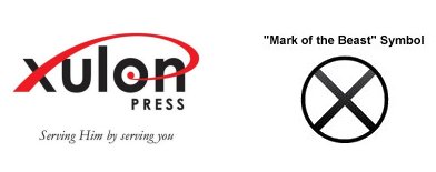
A competitor, Xulon Press, connects the X and O with a design that forms the easily recognizable fish that ate the phallus of Osiris. The Westbow Press brand features an arc that, in some of the imagery, encircles a central T or Tau cross. Subtle, but there it is. Encircled Tau = Cross Circle = XO MOB. Their latest brand refreshing made the heights of the letters more even to give the central T more emphasis.
Xulon uses the placement of the word, Press, to call attention to the word, On, which is the Egyptian city also known as Heliopolis that is known for obelisks (phallus of Osiris) that feature in the worship of the sun god. Westbow Press calls attention to the sun god in other ways.
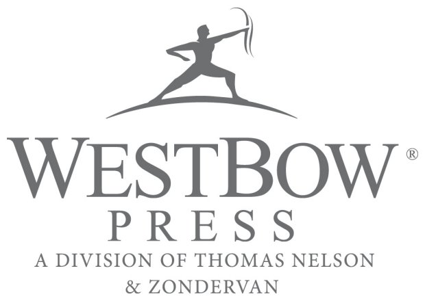
 Who is the iconic archer but Apollo, aka Helios or Horus? The fact that he's the sun god standing on the sun is seen in how the letters E and O are emphasized by the arc, with EO being a rough transliteration of the Greek word for, sun. Given that, the RE of PRESS adds a subtle but direct naming of the sun god, which is alternately spelled, Ra.
 The bracketing letters W are also emphasized, a pair that rotate to a pair of 3s to signal Code 33. The company's acronym of WP is also Code 33. P is 11 when Z=1. The rotated W is a 3. 3*11=33.
The odd squat of the archer and way the arm is crooked is supplemented by the accentuated straightness of his bow arm and the line of his forward leg. The 47th Problem of Euclid is signaled because the angle being emphasized matches to the 3.4.5 Pythagorean triple. Osiris union Isis produces Horus.

Because the subject of time is really so very important, its curious to note how the archer has already released the arrow. Time flies like an arrow, and the arrow has flown. If that's all there was to this imagery it wouldn't be so intriguing, but support for the time theme appears in the form of the bow. The shape is peculiar - not a simple curve or a recurve - and its doubled. The two wavy bits speak to me of wave glyphs, like the astrological symbol for Aquarius, the water bearer. Water-as-time.
The imagery derives from ancient times. Here's the goddess known as Inanna or Ishtar.
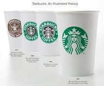 She holds three in each hand while the WestBow Press archer holds two in one hand. Perhaps two, to represent two timelines.
 Another brand that's very popular obfuscates two sets of the wave glyphs, presenting them as the mermaid-like Venus goddess' hair. Inanna-Ishtar- the goddess of Starbucks. She's crowned, with authority - over water-as-time.
No comments:
Post a Comment